By Michael Lynch, CCC, NRECA
The project to rebuild Cooperative.com started as a “simple migration.” We weren’t setting out to reorganize the site or redesign it. We just needed to move it from an older version of Microsoft’s SharePoint Server to the current version. However, as we got into the migration project, we saw opportunities for improvement that we could implement without significantly expanding the scope of the project, so we couldn’t resist making some high-impact changes.
Those changes fall into three broad categories:
- Content simplification
- Design enhancement
- Navigational improvement
Content Simplification
Cooperative.com has never lacked for content. In fact, we concluded the number one content improvement we could make within the scope of this project would be to remove as much out-of-date or low-value content as we could. This led to a multiple month evaluation of existing content, using a combination of usage data, publishing history, and legwork to get content experts to answer questions about the continuing value of older materials. As a result of our audit, we ended up removing more than 2,000 web pages and documents.
During the content audit, we also looked for places where we could combine the content from related short pages into single longer pages. The goal was to reduce the number of pages on the site and flatten the navigation; however, it also fits in with a current web design trend toward longer scrolling web pages.
Design Enhancement
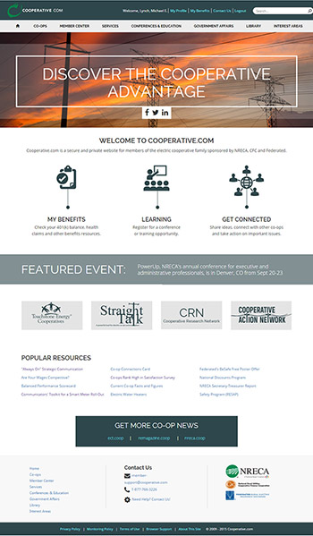
When we discussed possible design improvements for the site, the first we agreed on was to make it mobile friendly by implementing responsive page designs that could adapt to different screen sizes. While we haven’t yet seen many people trying to access Cooperative.com regularly with mobile phones, tablet use is definitely growing—especially among CEOs and directors. We took a mobile first approach to the new page layouts, meaning the site should look good and work properly no matter how you access it.
The second design improvement we tackled was a complete overhaul of Cooperative.com’s Conferences & Education section. A high percentage of site visitors come to Cooperative.com to find information about conferences and training, so we identified that as an area where we could make a big impact. When you see the new site, you’ll see that we redesigned the Conferences & Education section from the ground up—greatly simplifying the way you find information about events and training.
The final noteworthy design change involves Cooperative.com’s home page. We modernized the design of the home page by removing non-essential design elements in favor of a simplified design that directly focuses on getting the majority of site visitors to key resources.
Navigational Improvement
When considering navigation, we didn’t want to make large changes to the organization of content on Cooperative.com because that would have significantly expanded the scope of the project and would have called for extensive user testing to validate any proposed new structure.
However, we did look for opportunities to move key resources up higher in the navigation where they would be more prominent. And more importantly, we changed the navigation itself, switching to a “mega-menu” style navigation bar on the home page. If you’re not familiar with the concept, mega-menus are the kind that expand both vertically and horizontally to show you several columns worth of navigation at once. This approach lets you see more of the navigation with less effort.
It All Adds Together
While we didn’t set out to redesign Cooperative.com (with the exception of redoing the Conferences & Education section), when all of the changes we’ve made are taken together— the new home page, new navigational system and new responsive page designs—the site feels redesigned and considerably more modern.
I think it’s a big step forward. When you see it, feel free to let me know what you think.
